KateMotive
A brand from scratch, plus a full-stack production management application.
In the beginning of the COVID-19 lockdown, a sudden demand for face masks appeared. I’ve been consulted to help out in my family. My stepmother is a studied clothing engineer, and she, together with my father, decided to chime in. She came up with a face mask design that surpassed other available ones in comfort, but they were pretty complex to make.
They organized the production on paper cards though. And as demand started to rise, they could barely keep up between organizing and actually making the masks, working morning until night every day.
My involvement
Throughout my helping them out, I was involved in all aspects of the newly founded business, starting with the business registration and with handling taxes. I handled all digital aspects, like managing the Amazon and Etsy stores, doing convincing product photography, customer support (that there was a lot of), and more. On the non-digital front I was involved in procurement of production materials, logistics, packaging products for shipping, and more.
The most interesting tasks though, were building a brand from zero and the production management software I made.
The brand
We decided that, since the product was high quality, it’d be beneficial to build a brand reputation. But because the business originated literally from a living room, budget was extremely tight. So we decided to start at the touchpoints with customers. That meant standardizing the product photography and product pages in online stores, and introducing a brand with the potential to be recognized. The latter had to happen on the cheap.
The name was already decided upon, so I had to work with it. After some iteration I came up with the right combination of the logo and wordmark:
Of course, one of the main points was to use the branding in a print context, not only digitally. So the main colors were defined in CMYK, since spot colors would have been more expensive to print.
5, 62, 2, 0
10, 20, 30, 0
Pink being my stepmother’s favorite color, this was a non-conditional. She wanted the brand perception to be equally playful and glamorous, with the goal of being an indication of the product quality. Getting the two main colors right, so they looked as intended in both print and digitally, took lots of iteration and almost a dozen rejected samples from multiple print shops.
In the end, we settled on FlyerAlarm for their affordable good quality prints. Their packaging wasn’t quite perfect though, we had some minor rejects here and there.
In any case, this is how most customers received their orders:
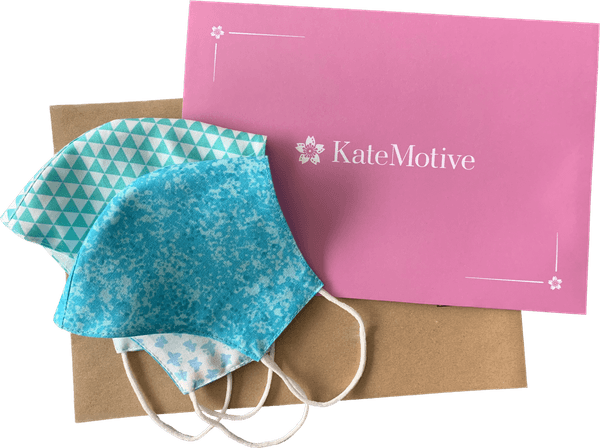
Customers received a brown shipping envelope made from recycled paper with a modest black logo print on the top left of the front, with the shipping address opposite of that at the bottom right. Inside, they would find the so-called pretty envelope: A striking, inside and out custom printed, pink envelope with the logo in white on the front, also made from recycled paper. Inside that, they would find each mask neatly folded inside a white paper bag.
We received lots of unsolicited customer feedback specifically citing how they liked the packaging. Regularly we read that customers used the pretty envelope as gift packaging, even for gifts other than the face masks.
Implementing the branding into the packaging this way turned out to be a significant success on our journey to convince customers. And it was really cheap, too. FlyerAlarm would make 500 pretty envelopes for about €100. 500 of the brown shipping envelopes would run in the neighborhood of €50-80, same for the paper bags. For about €0.50-0.60 per order we had a value-add that didn’t appear to be offered by other sellers, and was actually appreciated by a significant number of customers.
I believe that was part of the magic that made straight 4-5 star reviews on both Amazon and Etsy possible. The average across both platforms and all products was 4.6.
KateMotive Organizer
The main reason I joined my stepmother and father was them organizing the whole production via hand-written cards. Between the two of them, they were able to plan and manufacture about 10-15 masks per day.
As a platform mostly for buying mass-produced things from stock, Amazon quickly imposes penalties for delayed shipments. And over the years, customers learned to expect Amazon orders to be quick. But as new and repeat orders started to really roll in, I noticed the air becoming thicker with stress.
So I started building a piece of software that would help them ease their organizational troubles. They were against it at first, but they didn’t imagine the barrage of orders that would follow soon after.
Thankfully, there was not a lot of automation to do, which simplified my job. Essentially, they needed an interface to track each face mask through a very simplified process. Mostly, just to not forget any of them.
The solution
For each order, a card that would have some basic information about the order, and the face mask designs and sizes contained within, would be pinned to a wall. The inner and outer layer material for the face masks was cut out grouped by size and design (customers had lots of designs to choose from). Then, a diagonal line would be put in the check-box on the card. The four parts per face mask would then be grouped together by order, later to be sewn and ironed into the final product. Lastly, the masks belonging to an order would be hung off the same pin as the corresponding card on the wall. They’d be ready for packaging. In order for my stepmother to retain an overview from her “workstation”, she would draw the second line in the check-box on the card - crossing off masks she had finished for an order.
I assumed that, since face masks were crossed off one-by-one on the physical cards, the application had to support that as well. That means each face mask had three states of completion, pretty simple: Not started, in progress, and done. In actuality, the middle state went mostly unused because it created too much overhead synchronizing that with the state on the physical cards. Instead, after shipping out the orders for the day, the cards were removed from the wall and taken to the computer running the app, to mark all masks in the shipped orders as done.
In any case, I had to create a system that could support and accelerate this already established workflow. That meant the killer feature would be creating card PDFs that supported orders of any size, with all the relevant information, all without wasting too much toner. It took a little iteration on the layout, but soon the program I dubbed the “KateMotive Organizer” spat out well-behaved card PDFs:
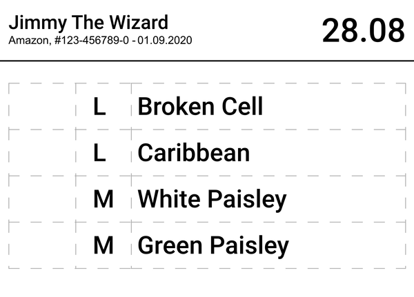
The app’s backend is based on a Node.js Express server with a now long-unmaintained NeDB database (maintained forks do exist). Additionally, I implemented live synchronization via socket.io. Mostly just for fun, but it turned out really useful at the end. Since the app was needed only locally, I conceptualized it as a Windows application that would spawn a server that could be connected to from the local network. The computer the server was running on was just another client using the app.
Using PDFMake I could create a table to fill, that would also automatically overflow to multiple pages if the space wasn’t enough.
The frontend
Creating the PDFs was one of the easier problems to solve. Creating an easy to use interface around it was the harder part.
To make iteration on the layouts quick, I used partial server-side rendering for the frontend using EJS, and Bootstrap for the styling. But since I knew that the app would quickly have to manage thousands of entries, server-side rendering wouldn’t be performant at some point. At least not in combination with the socket.io implementation. That’s why I decided to implement the client-side code without a framework, in pure JavaScript.
The frontend would manage content diffs sent by the backend via socket.io to make the interface snappy. They were data-only JSON divided into elements to be added, elements to be edited and elements to be removed. I also later implemented infinite scrolling with a crude virtualization implementation. That wasn’t performant enough on lower end devices, so in the end a simple server-side pagination had to suffice to make the page perform well on an ageing iPad Air 2.
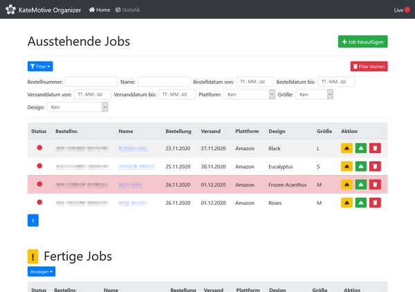
The main webpage of the KateMotive Organizer. The main table containing face masks data located centrally, with colorful buttons to the right of each entry. A red pulsating circle indicating a ‘live’ synchronization status is in the navigation bar on the top right.
It’s pretty simple in concept. Once added, face masks would have a red dot to indicate the “not started” status. On the right, three buttons per entry are located: Two to set the other two states and a delete button. The two state set buttons would immediately trigger the state change, while the delete button triggers a multi-function modal that asks whether to delete only that entry, or all entries belonging to that order.
I also implemented complex filtering for the list of face masks. Some filters are added by AND, some by OR logic - depending on feedback from my stepmother.
This is how adding an order looks like:
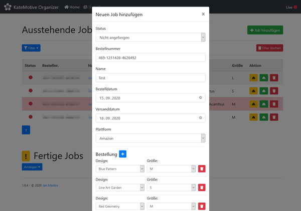
There wasn’t enough time to implement automatic pulling in of new orders from the different online store systems (though technically it would’ve been possible), so I tried to streamline this interface as much as possible. In order to reduce errors, the app has a set of mask designs and sizes configurable via simple JSON configuration files, limiting the selection to the ones currently most relevant.
After pressing enter on the keyboard, or clicking the “Next” button at the bottom of the modal, a second modal opens with a preview of the card about to be printed. Here, the user would have the choice to only print, or print and save the masks they input. This served as a last check before saving. Were that preview modal closed, the other would open back up with the input data retained. Pressing outside the modals to close them was specifically disabled to avoid losing any information.
And here’s the stats page:
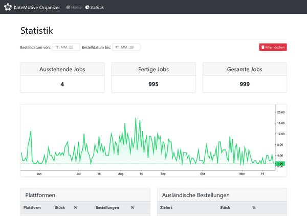
It aggregates orders by interesting stats, like international orders, most prolific customers, grouped by platform, and so on. The chart plots orders over time and uses Lightweight Charts for the visualization.
Getting printing to work
Printing the cards was a special challenge. The printer used for cards and printing the logo on the brown shipping envelopes was an HP LaserJet Pro M1132. Unfortunately, its outdated driver didn’t play well with printing from Chromium-based browsers. The browser’s printing function added unexpected margins to the A8-sized prints, while printing a PDF via the Windows print dialog worked perfectly.
After some trials and tribulations, I settled on a slightly unorthodox solution based on Sumatra PDF. It has helpful command line arguments, some of which are specifically meant to configure printing. The command actually used is pretty simple as a result:
sumatrapdf.exe -print-to-default -print-settings 'portrait,monochrome,paper="A8Card"'A8Card is a paper size previously added to the Windows print dialog.
The backend would create the PDF as a physical file, start the print, and optionally delete the file after creating the print job.
Verdict
The project was packaged as a convenient standalone executable using pkg, and rolling out updates was as simple as replacing it and restarting the application.
In short, without the KateMotive Organizer, the influx of orders wouldn’t have been possible to handle. Most customers first ordered a couple face masks at most, and in subsequent orders ordered more and more. The largest order was held by a company who ordered 46 face masks at once, all to be delivered in a short amount of time.
In that frenzy, the KateMotive Organizer held up perfectly and allowed us to focus on other things, like procuring more materials to keep certain designs in stock. And, most importantly, to provide high quality and comfortable face masks to customers. Production could scale from 10-15 face masks a day to 40-50 at the peak.
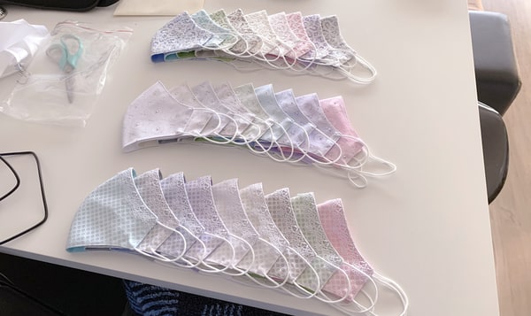
The brand and the decisions made for packaging played a part in putting the name out there, and the face masks appeared convincing enough to build trust. For starting from zero, I believe this is a pretty good result. We’ll explore this brand further in the future.