Petman.de
A content management system built from the ground up, plus the company website made with it.
Visit the website here: petman.de
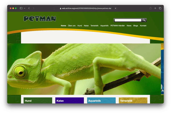
In 2016, Petman, a German pet food manufacturer specializing in BARF, did a slight rebranding in order to modernize and approach a younger clientele. They didn’t update their website as part of the rebranding though, because they were looking to move away from their antiquated WordPress deployment that they had since 2011.
The pains to fix
The team maintaining the website were grappling with technical issues related to their WordPress installation running on 1&1 (now Ionos) services that were long superseded. The maintainers had no web development experience, consisting of copywriters and packaging designers. They cited numerous issues they had editing content on the website, breaking it regularly.
The WordPress theme used was customized by the previous developers from a ready-made theme. And that came with several drawbacks and pains. Alleviating them was the main reason for requesting a complete makeover from the ground up, in addition to providing a simpler content editing experience.
Confusing home page
The home page didn’t make it clear what the website is about.
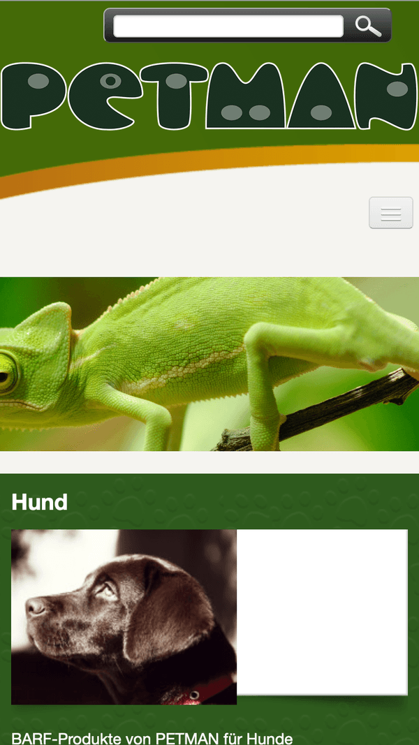
It was dominated by a huge slider that, for a long time, only acted as a hub to visit the different product categories. Below that was also a hub for visiting the product categories. As a result it pushed meaningful content way below the fold. And it wasn’t better on mobile:
The new homepage had to make the purpose immediately clear and have a responsive layout in a way that wasn’t broken.
Discoverability
Another of the theme’s major drawbacks was the navigation concept.
Previously meant for a blog/news website, it split the navigation into a main navigation at the top and a sub-navigation in each of the top categories that vertically lived somewhere around the fold. That sub-navigation meant terrible discoverability for visitors coming to the site for the first time, as there was no clear indication of the function or intent. Additionally, that sub-navigation was broken on touch devices:
The sub-navigation could also have submenus (that wasn’t indicated in any way) that were only accessible by hovering. When touched, they would open the webpage designated to the subcategory of that submenu, instead of just opening the submenu.
Performance
The WordPress installation was weighed down by a myriad of installed plugins and legacy hosting services that weren’t upgraded since the initial deployment in 2011. Even using a decent 100 Mbit/s cable internet connection in a bigger city yielded page loading times in the seconds. The Internet Archive links visited to capture the screenshots and videos here are even a little faster.
Unfortunately, no PageSpeed Insights scores exist from the time. But Google Analytics was telling the team that the page suffered from bad visitor retention, partly because of sluggish performance.
My involvement
A complete transformation was required. In collaboration with the whole team at Petman I came up with a long list of requirements that included some new ideas to make the website more useful to customers than a simple infodump. Additionally, we came up with multiple features to make editing content on the website easier, even and especially for non-techies.
I decided to first see if the project could be done using one of the headless Content Management Systems that were taking off at the time. The two I was most interested in were Directus and Strapi. And, unfortunately, both didn’t offer the tools needed at the time to build custom editing interfaces. They were great for creating and filling databases in an easy way, but even still it wasn’t easy enough for non-techies. I believe tools like Airtable pioneered making databases online understandable for everyone without training, and of course Directus and Strapi both came a long way since 2016 when I was working on this project.
In any case, after confirming that headless CMS at the time wouldn’t be able to provide what was needed, I decided to build a custom CMS from the ground up, tailored to the needs and wants of the Petman team. And, of course, WordPress was already not easy enough to work with. Using it again would’ve incurred some of the same problems down the line.
The backend
I needed something that would allow me to develop quickly and still get a performant and stable result. So I decided on a Node.js Express-based server with EJS for server-side rendering and a MongoDB database with Mongoose enforcing schemas. Today maybe I’d have chosen a different database, but it’s a decent enough choice still. And it provided a crucial feature for the new website: Geo-queries.
Admin UI
I started with building out the admin interface first to have something to populate the website with.
The requirements stated that all the content had to be editable by non-techies. That meant building specialized creation and editing UIs for certain types of objects in the database. First up were pages and files. Since there would need to be special kinds of pages that would consume special kinds of data, I defined six types of things in the navigation structure:
- Category
- Acts as a container for other items, can link to something.
- Page
- A “normal” content page that can be edited using a WYSIWYG HTML editor.
- Product page
- A content page specifically to render product categories.
- Advanced page
- A straight-up EJS template to be rendered. Used for pages like the home page, the blog page, and others.
- Link
- A simple link to any URL.
- Separator
- Exactly that.
This is the page editing interface for editing a normal page:
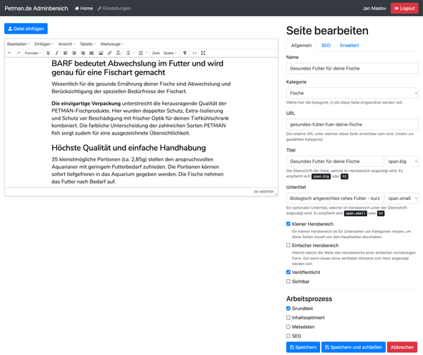
Similar to older versions of WordPress, this uses TinyMCE as the editor for website contents, with a highly customized configuration. The output is filtered by the editor and by the server upon saving in a customized way, because it turned out that copywriters really loved to write in Microsoft Word and copy over the text.
There’s also access to the file manager:
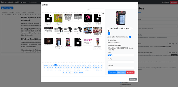
Adding files in any TinyMCE content field inserts a shortcode that intelligently decides the rendering based on the media type. The shortcodes are also sent to the server for rendering and the result is inserted as a non-editable element in the TinyMCE editor.
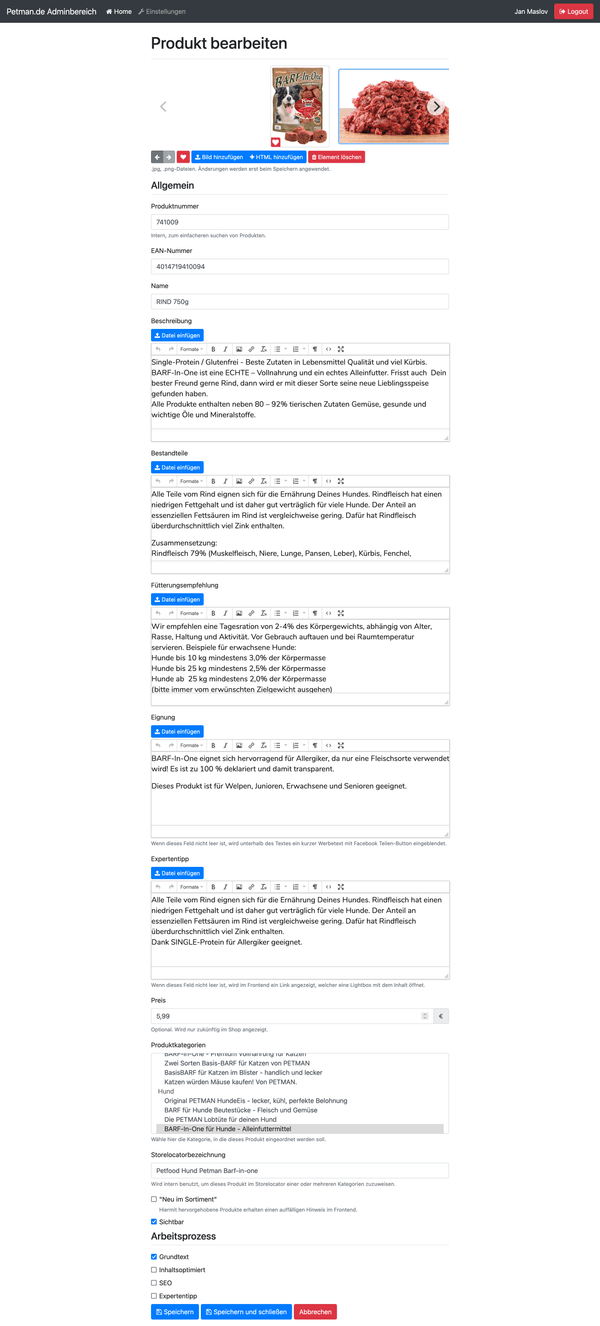
Additionally, there is special editing for product categories and products (scrollable because it’s a long page):
The storelocator
The storelocator was another one of the special requirements to make the website more appealing to customers. Petman distribute their products mostly through retail stores (or at least they did at the time of the project). They are represented in lots of points of purchase throughout Germany and the surrounding countries.
Their retail network is represented in the storelocator as an easy to use way for customers to find retail stores near them:
This uses MongoDB’s geo queries to quickly find the nearest stores to the provided coordinates, that are found by geocoding. Geocoding requests are anonymized and sent to Google’s geocoding API by the backend (so no user-identifiable data is shared). The returned coordinates are then used for the geo query and limited to the three closest results.
Pretty simple in essence, but the dataset had to be imported and indexed by the database for it to work. And that had to work for non-techies as well, so the CSV parsing must have been very permissive and/or offer many fallbacks. The origin dataset from Petman’s CRM was somewhat dirty and incomplete, so rules for fallback values were part of this feature’s requirements. The backend uses Papa Parse with a bunch of custom handling.
The map
Previously, the storelocator used Google Maps. When in 2021 extended GDPR-related laws were implemented in Germany, cease-and-desists related to the usage of Google services became numerous. We decided to look elsewhere for the map used in the storelocator. I noticed that map hosting services could be very expensive, and open source tools surprisingly approachable.
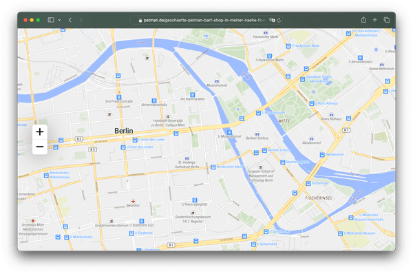
I decided that the best combination of quality and price would be to self-host. Using tilemaker to make customized vector tiles from OpenStreetMap data, TileServer GL for hosting and MapLibre GL JS for the visualization allowed for an extemely fast and lightweight solution. I was floored by how easy the whole process was - once I had enough RAM installed in my PC to make the tiles using tilemaker.
Of course, the code for making the map interactive in the context of the storelocator had to be rewritten, but MapLibre GL JS is surprisingly fully featured.
The result is a beautifully detailed map rendering at 60 FPS on most devices:
Performance considerations
To avoid walking into the same trap as with the previous WordPress website, I found that caching would play a big role in making the server-side rendering perform well. The website initially launched without caching and simply rendered the HTML on every request. That was fast enough, because the MongoDB queries were decently fast and EJS rendered templates pretty quickly, but I knew that it wouldn’t scale enough.
Over the next releases I fully decoupled the rendering into a separate process that dealt with caching the data needed for rendering as well. The data is stored in a Redis cache, while the pre-rendered templates live in RAM for maximum runtime performance. As soon as an edit happens, the in-memory cache is invalidated and the pages rendered on first request. The render data that lives in Redis is invalidated on a per-object basis, so the EJS renders are still very fast, because they mostly don’t cause MongoDB queries.
Static assets are served via Nginx, the reverse proxy server, directly. So no Node.js-overhead is incurred for them.
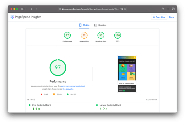
Combined with frontend optimizations, this results in amazing performance for a website with a CMS behind it. Could only be better if all pages were fully pre-rendered, like with a static site generator:
The backend provides a rich featureset in other respects as well:
- Image optimization via MozJPEG and pngquant
- Quality assurance via work-process checkboxes for pages and products
- Extensive SEO features
- User management with RBAC
- Shopify integration (currently disabled)
- Automatic backup management
The frontend
I designed the frontend with an eye for simplicity and accessibility to older customers, who were still the bigger part of Petman’s clientele at the time. At the same time, I aimed to shift the brand into a friendly and approachable light by opting for Nunito, a rounded font, and pastel colors throughout.
Tackling the confusing home page
I designed the new home page and wrote the copy for the initial version of it (at this point it has seen many further iterations) to be immediately clear about what Petman does, first and foremost.
Around the fold, many visitors would see the beginning of a large headline prompting to pull them in and get further acquainted with the purpose of the website.
(As a sign of respect to Ukraine, the hero colors on the homepage are blue-yellow at the time of writing.)
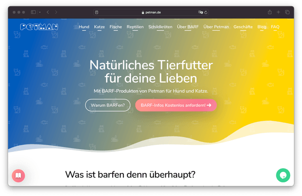
The hub with the four animal cards has survived the transition. It’s just located towards the bottom of the page and acts as a call to action to lead visitors further once they agreed to scroll down to find out more from the initial copy.
Tackling the discoverability issues
We decided that the website should have slightly less main content than the old one, which allowed to mostly drop multi-level nested navigation. Almost all main categories seen in the website’s header don’t have nested categories. The mostly visited categories don’t have them. This allows for easier discoverability of content for users and makes navigating the site quicker.
Additionally, product pages, that were previously nested in subcategories, or only available via hub pages, are now clearly and easily available.
Products open in dialogs, but can also be visited by URL for SEO reasons. In general, many SEO-related problems have been fixed with the new website, so it ranks way better in all search engines, which also aids customers in finding what they’re looking for.
Tackling the performance
When the website first launched, the frontend was made interactive using jQuery for compatibility reasons, but as soon as support for Internet Explorer went away, that was replaced with lighter weight pure JavaScript plugins and utilities later on. This dramatically cut down on the amount of JavaScript to be loaded and parsed and was instrumental in getting the PageSpeed Insights score as high as mentioned above.
Part of the process of porting to pure JavaScript was replacing the jQuery plugin used for making the navigation responsive. The frontend used StellarNav.js before. I manually ported it to pure JS and simplified it to make it even lighter weight than it was.
Verdict
While I wouldn’t recommend to create a custom CMS from scratch these days, in 2016 the situation was different though. The staying power of this solution (going on for over 7 years since first release at the time of writing), and the lasting happiness of the Petman team with it, demonstrates that it was the right decision at the time.
At release, the new website boasted loading times in the low hundreds of milliseconds, compared to seconds before - even with a fast cabled internet connection. TTFB was reduced by over 35%, leading to a PageSpeed Insights overall score of 100 back in the day. With further improvements, the website is still really fast, with a PageSpeed Insights overall score of 97.
The user experience improvements brought by the new custom content management system dramatically increased visitor retention, in both numbers and in session time, sustainably helping SEO.
