Russian Doll Hair Extensions
A bespoke customer-facing appointment booking system and an online store.
Visit the website here: russiandoll.com.au
I’ve been approached by the team at Russian Doll Hair Extensions, a hair extensions studio in Sydney, Australia. They were having troubles with organizing appointments. Since the salon grew from a one-person operation, the processes around it weren’t adjusted in accordance with the team size.
My Involvement
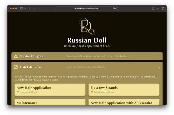
The whole process of booking appointments had to be done from scratch, since they were managed via direct private text messages with customers beforehand. I handled the whole project from start to finish, incorporating feedback as I went:
- Creating an exhaustive list of requirements
- Solution architecture
- Application architecture
- UX design
- Security engineering
- Backend engineering
- Frontend engineering
- Testing and bringing the solution online
Additionally, I heavily modified a Shopify theme and worked out a concept of presenting the products as required and brought the store to launch. I also created a rudimentary company landing page website that served as a substitute until the Shopify store launched.
Hair Extensions Are Tough!
I knew from the start that time was a major consideration in this project, so I wouldn’t be able to engineer a whole appointment booking system. I assembled a list of potential appointment booking systems that I evaluated based on the given requirements.
Hair extensions turned out to be a pretty difficult thing to book appointments for!
The requirements included handling of payments via Square, being able to ask potential customers a pretty extensive list of questions, so the team knew before the appointment what materials they had to have prepared. But the real kicker was that they required customers getting a cost estimate for their appointment configuration. Usually, that’d be a given. However, as it turned out, appointment times and the material costs can vary a lot.
All the systems I explored offered a questionnaire to fill out in order to book an appointment. None of them allowed answers to those questions to influence the cost estimate.
Acuity Scheduling was the only one that allowed for a list of options, but those also weren’t connected to the questionnaire.
Booking: The Solution
I went with Acuity Scheduling for its API access and Square integration. I expected that would yield the best chances for being a workable choice. Most systems didn’t even offer a publicly available API.
To be able to share types and have a smoother development experience (in the name of time), I decided on using a node.js backend with a React frontend. A very traditional choice for the frontend, but that made getting out a first version easier, which could then be ported to Preact for performance reasons. The whole solution does not require a database. Everything needed simply lives in application memory.
To reduce development time further, the backend API is based on a tinyhttp server. To avoid spending too much time on building components for the frontend, I decided on mui.
The Backend
In the beginning of the project I tried to engineer the backend API on Bun and Elysia to try the framework’s automatic validation feature, but Bun turned out to be unstable at that point. I had to port the project over as a result. The solution was a little too bleeding edge. Thankfully I started testing early, so I noticed when the project wasn’t as far along at that point.
Acute Woes
It was clear that Acuity Scheduling’s integrated booking interface wouldn’t provide all required features, so I had to build a custom booking frontend.
The Estimate
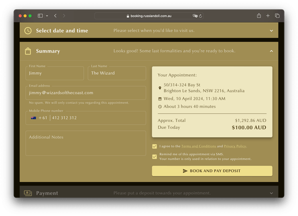
The idea was pretty simple: The custom-built parts of the solution would handle the business logic of deciding on the cost and time estimates. Then, a fitting appointment would be created in Acuity.
Unfortunately, it turned out that Acuity’s API didn’t allow booking appointments that weren’t pre-configured. Additionally, if answers to the questionnaire were to be stored alongside the appointment for the team to see, they had to be created in Acuity beforehand. On top of all this, the API also didn’t allow setting custom appointment lengths and prices. They must consist of data that’s living in Acuity’s system. This threw a wrench into my plans.
Thankfully Acuity offers appointment options. Usually meant for things loosely related to the appointment, like a coffee for your appointment at the barber, options allow prolonging appointments and raising their price. When creating an appointment, the backend will calculate the estimate and then assemble a combination of appointment options previously defined in Acuity that will closely approximate the estimate’s time. That would allow for the rest of the systems at play to work, like letting Acuity finding the best times for the appointment based on working hours and other existing appointments.
But money was another issue. While appointment options offered to also increase the price of an appointment, the configuration options would vary so wildly that I wasn’t able to approximate an appointment’s price using only appointment options created in Acuity. Because Acuity’s API also didn’t allow setting a custom price, I had to drop using Acuity’s Square integration and implement it myself in the backend.
Complex Appointments
Another requirement that cropped up later on was handling of what I call complex appointments. Doing hair extensions requires a lot of effort. The appointments are not only pretty expensive, but can also take a whole workday (or even more).
Some types of appointments require multiple workers for a single customer. And after re-evaluating all appointment booking systems, none of them support that. So choosing Acuity over some other system made no difference here, but the problem still had to be solved.
The biggest problem was performance. Customers must be able to see at a glance what days in a given month their appointment configuration can be booked. Blocked days should be grayed out.
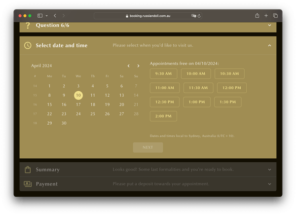
The naive way would have been to query the working hours and appointments of each worker for every day in a given month and find possible time slots that way. But not only does Acuity Scheduling’s API not provide working hour information, but the API is also made in a way that doesn’t allow for bulk querying. This would mean querying days one-by-one. That would’ve been unacceptable, since it would take a pretty long time (on the order of tens of seconds) per employee.
Using Puppeteer I built an automation that would periodically log into Acuity Scheduling using an account created specifically for this purpose and scrape working hours from the website there. This information would be cached and later used when assembling possible time slots for complex appointments.
When requesting possible days for an appointment requiring multiple employees, the per-day working hours data of each employee able to handle this appointment would be used to create all possible time slots for a month. Then, thankfully, Acuity’s API allows for querying an employee’s existing appointments for up to a year in advance. This data is cached periodically as well. In combination, these datasets allow to filter all theoretically possible time slots down to what’s actually possible, per employee.
Finally, we can then determine the best combination of employees for each day in the month the customer requested in the frontend, by prioritizing employees with the most time that day.
Getting to that point was a doozy.
Performance
As mentioned previously, performance was a pretty important consideration of the booking website. While React wasn’t the best choice in that regard, porting to Preact will improve the already pretty acceptable performance, as shown by PageSpeed Insights:
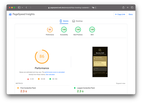
Because customers will often come to the booking site with an intent to at least get to the summary to see the price estimate, the booking website has a lesser role in converting customers. But it nevertheless shouldn’t deter them by making the process of booking take a long time. So after the considerations described above, getting available days and times for a complex appointment with two employees takes under a second in most cases.
The website is fully static, so it’s served via a CDN. The backend is hosted on a VPS in Sydney though, because customers can upload photos, and they’re being stored on there for cost reasons.
Russian Doll’s Company Website
Aside from enabling customers to book appointments and generally representing the company online, one of the main goals all along was to sell high quality hair (the same used in the salon) and related accessories via an online store. But taking the pressure off in terms of managing appointments and employees had the highest priority. Figuring out the proper way to segment and display products had to come later.
Knowing that, I prepared parts of the store, like the general design language, and some of the preliminary texts in advance.
But a lightweight landing page had to come before that to represent them on the web, and to steer customers towards the new appointment booking website.
The Landing Page
To give the website more credence, we needed media to show off the place, the equipment and the people. Because I’m operating from Switzerland, I had the team order a photographer and take detailed pictures of the salon. Then, I directed them as to the “glamour” photos they should take, the angles and actions portrayed in them. I think they turned out great!
I incorporated them into the Shopify store. Then I literally saved the store’s partially done homepage via the browser, converted it into an Astro one-pager and polished it up. That would make the eventual transition to the store under the same address less jarring for visitors, as the visuals would remain preserved.

Of course, I paid utmost attention to optimization, so the page loaded quickly and didn’t waste time to show potential customers what they can expect.
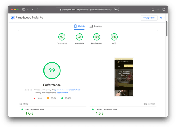
Astro made the transition really easy. The hardest part was stripping stuff that was useless for the one-pager, like all of the store features and related styling, without breaking the general look.
The Shopify Store
It turned out that hair of a quality that people actually want to have on 24/7 is hard to come by, especially in Australia. So Russian Doll decided to start distributing it in an easy way, since they are already sourcing the products they use for appointments anyway.
Knowing how the team used Square as a payment processor (POS and now also digital) extensively because of their mostly painless setup process, I knew that the best path forward would be to use Shopify as the undercarriage. This would not only provide good enough performance and UX (especially Shopify’s checkout is excellent), but also absolve me of many hosting and maintenance-related tasks in the long run.
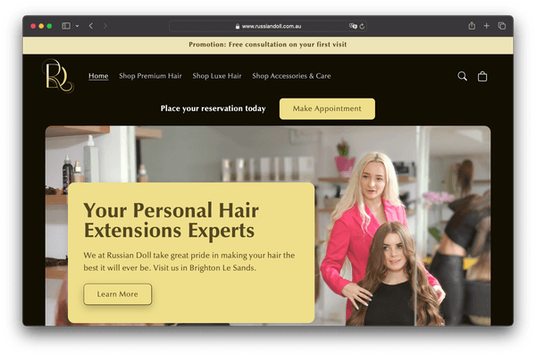
Because I needed to quickly set up the store to then convert parts of it into the one-pager mentioned previously, I chose to go with a theme and modify it. The theme that ticked the most boxes turned out to be Shopify’s own Refresh - a pretty fully-featured theme in terms of the basics in my opinion. It’s not exactly lightweight, but far from heavy as far as store themes go (counting in things like WooCommerce, Shopware, etc.), and it has lots of customization features to boot. I wish Shopify placed a little more emphasis on Hydrogen and Oxygen, their headless backend offering, to build up its legacy like it did over the years with the server-side rendered Liquid-based themes.
For the setup that went online in the end, the theme still required quite a few source code changes. That was in part to accommodate the “Luxe” hair extensions products that are condensed to a single product page, with flexible configuration options and the ability to purchase on a per-gram basis.
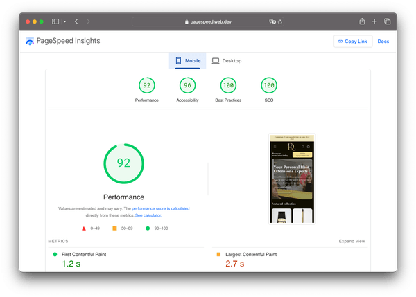
But nevertheless, the end product still performs admirably:
Verdict
I’m glad I took on this project. I got to try Bun in a real production project (and ended up empty handed), but more importantly it was a great exercise in integrating with not exactly favorable external systems.
The business requirements meant that performance optimizations were very important and appreciated. I’m happy that I was able to find workarounds to make it possible. The custom work done to make questionnaire answers influence the time and cost estimates probably makes this the only booking website capable of providing deeper insights for both customers and employees.
In any case, the team has been using Acuity Scheduling and the new booking website since the beginning of 2024, and has been delighted by it. After they onboarded all customers that were currently still handled via direct messages, and started directing repeat customers to the booking page, word quickly spread about it, and the team is regularly booked out as a result.