tempcontrol
A comprehensive company rebranding and website.
Visit the website here: tempcontrol.info
tempcontrol partners with Petman, among other companies. After they saw my work for Petman, they also requested a new website for themselves. In addition, they requested a significant rebranding to modernize.
My involvement
And that’s what I did. First up was the logo and the brand colors. The team wanted something fresh and modern looking, but that would also hold up over time. They were coming from this logo and had several problems with it:

As a company rooted in hardware and software design, they told me that investments into visual design were minimal. In fact, that logo was done by one of the employees. The main problem they had with it was that people were misreading the company name. Because the main product’s software runs on PCs, they decided to stylize the company name to “temPControl”.
And people pronounced it exactly like that: tˈɛm pˈiː sˈiː ˈɑːntɹɑːl, or “tem PC ontrol”.
They must’ve really been trying, because that pronunciation is not exactly easy to wrap your head around.
Of course, the intended pronunciation is tˌɛmpkɔntɾˈoːl, as a single word.
That was the most important functional change the new logo had to provide.
Additionally, they lacked a negative version of the logo, so they used it exactly like above in print. Prints were coming out less than pretty, with banding issues in color, and unintended differences in contrast in grayscale. Lastly, they didn’t have a vector version, so large prints used for exhibition stands would turn out blurry.
To my surprise, they liked my first attempt so much that it became their new logo. After a couple iterations of polish it was ready to go:
Of course, now dropping the “PC” stylization of the wordmark, I decided to place slightly more focus on the temperature part by turning the o closest to the middle into a thermometer bulb.
The logo uses a modified version of ITF’s Poppins font.
I changed not only the spacing, but also rounded off the ts corners where the crossbar and ascender meet to give it a more Circular look.
I also rounded all corners a bit for a more friendly appearance, while retaining a clean and modern technical aesthetic.
Next up were the brand colors. Here, the team requested something really flashy, but that would still work in the future, with the intent to stand out. I decided to support this decision, so to reinforce the temperature theme, I chose a striking ultraviolet blue and white as the main colors, with an almost black blue color for use on white.
Of course, that would mean a split for print colors, because there’s no way to replicate that blue color with CMYK or spot colors. So we settled on the following colors for print:
It’s a compromise in flashyness, but everything still looks alright.
The website
Of course, the team also required a modern website to back up their newly acquired logo. In tight collaboration on the contents the team and I defined what the website had to offer, and I got developing.
Because of the vibrant, but nevertheless limited color scheme, the website had the potential to become bland. I decided to keep the text color on white solely to the dark blue, but interspersed lots of ultraviolet blue icons and put lots of effort into animated illustrations.
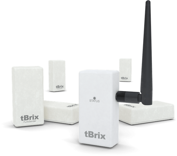
For some of the marketing materials I created photorealistic 3D models of tempcontrol’s main product line: tBrix - accurate temperature sensors with extensive monitoring capabilities.

And because these white-gray-ish boxes also look pretty bland, I thought to spice it up a little with a simple Three.js scene on the homepage:
When visiting the site, an illumination texture flashes the LED on the sender unit. The unit only starts to rotate after a few seconds of suspense. It can also be rotated by input from mouse or touch.
The website also features other hero animations. This one’s for the tBrix product presentation page:
A little simpler, but still eye-catching. All illustrations are animated using only CSS animations for performance reasons, at most switching CSS classes via JavaScript.
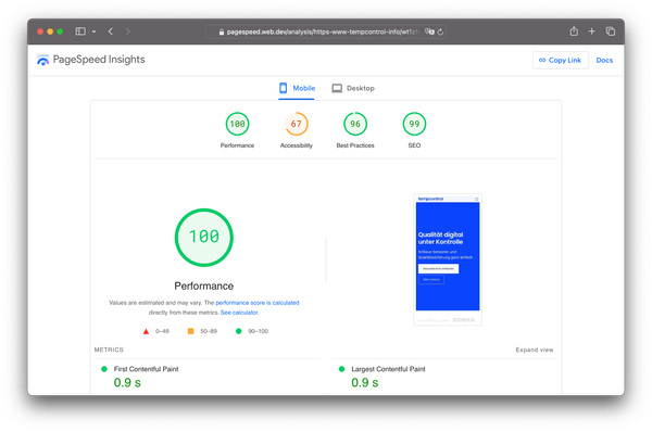
In that spirit, the focus was on performance, reflected in the PageSpeed Insights score:

This is from the homepage. It’s afforded by recognizing the requesting device’s resolution, and only loading Three.js and the 3D model when it should be displayed.
Technically, the website has a minimal Node.js backend using a Polka server and EJS-based server-side rendering. But there’s nothing too special about it, other than to be able to send email when contact forms are sent, and to be fast, of course.
Verdict
Because the team had a good grasp on what they wanted in terms of content, we had lots of effective teamwork. What they lacked was a direction for their visuals. As a result, they were extremely happy with the website and the rebranding.
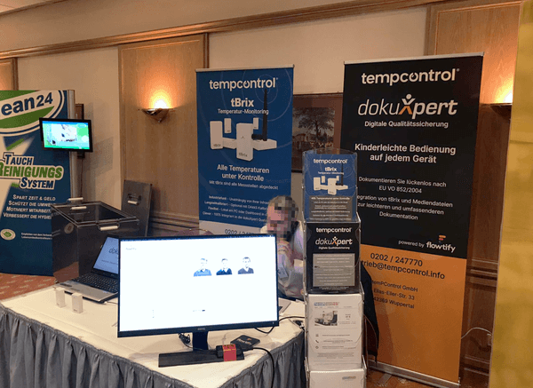
With the rebranding they received significantly more visitors at trade shows and online ads were heaps more effective because of the professional look and salient colors.

Shortly after the website launched, they have received feedback from multiple potential customers, saying that tempcontrol was selected because they noticed the new website. The rebranding and product presentation on the website were described as confidence-inspiring, and tempcontrol received numerous serious requests in a matter of weeks.